MHS Chemistry
3-D Periodic Trends
.
 
In the spring of 2001 a student of mine named Dave Mack became the first to answer a challenge I had long posed:  He came up with a way to generate live graphs of periodic trends laid over a map of the periodic table.  Most chemistry students are familiar with the usual 2-dimensional graphs, such as this one for boiling point.  I have found that these are interesting tools to teach graph navigation ("Where are the noble gases?  Can you explain your choice?"), but not always so helpful for learning broad periodic trends.

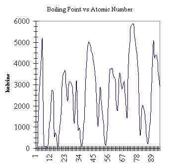
I had seen a graph once in a textbook that showed a trend with the property graphed as columns in the elements' locations, and I was impressed with the clarity of the trends.  So my challenge was to write a program that would let a user select a trend to be graphed as columns, then rotate the picture to get different views.  I had been teaching myself VB to get this done, but it was going pretty slowly, so when Dave asked if he could do this for a project, I jumped at the chance, and Dave did a great job.

Click here to download the spreadsheet.  It's an Excel 97 spreadsheet, and the program is a macro.  Make sure you scan it first if you are nervous.  Click the option below whatever trend you wish to see graphed, then view the chart spreadsheet.  Enjoy!

For those of you who are slick with the VB macros, I encourage you to add to this program.  The following is a list of "next steps" that I have in mind for the future - I am interested in hearing from you if you can get these done.
more properties


Have fun & Good luck!

[MHS Chem page][MHS AP Chem page]